September, 2025
In contemporary office environments, design decisions are increasingly influenced by the psychology of colour and the need to create spaces that balance productivity with wellbeing. As autumn arrives, its palette of earthy tones and natural warmth provides a valuable reference point for architects and flooring contractors looking to shape interiors that feel grounded, comfortable, and connected to the wider environment.
Autumnal colours are often associated with reassurance and steadiness – qualities that sit comfortably within professional spaces. Rich browns, soft clays, and muted neutrals evoke a sense of calm and can reduce the visual fatigue caused by overly stark or bright interiors. In offices where teams spend long hours, the grounding influence of these hues can support concentration while introducing a more welcoming atmosphere.
Beyond psychology, there is also a cultural element. Seasonal palettes subtly remind us of cycles and transitions, which can make office environments feel less detached from the natural world. This biophilic influence – without requiring literal greenery – has become an important part of contemporary workplace design.
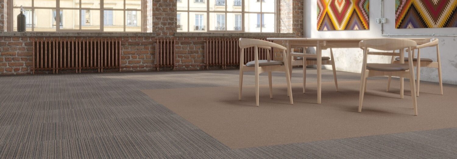
PROGRESSION II 1512 Biscotti is an example of the rich browns and naturally inspired colours that are design to replicate the autumn aesthetic. 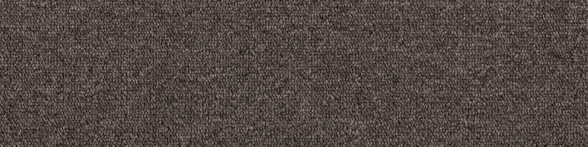
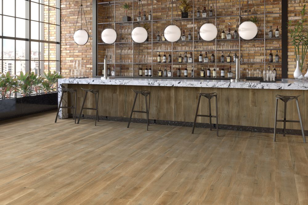
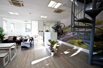
Colour alone rarely defines a scheme. How materials interact with light and texture is equally critical. Autumn tones work well when layered across different surfaces – soft carpet tiles that provide warmth underfoot, complemented by natural-inspired wood finishes in circulation areas or break-out spaces.
For example, a combination of lighter clay tones in open areas with deeper biscotti shades for accent or zoning can create a subtle hierarchy in the floor plan. Similarly, woodgrain designs inspired by coastal driftwood or oak can transition between formal and informal zones while maintaining visual continuity. This approach uses flooring not only as a practical necessity but as a tool to guide movement and reinforce design intent.
Autumn palettes carry a traditional quality, but they can be applied in ways that still feel contemporary. Pairing earthy flooring tones with clean architectural lines, glass partitions, or modern furniture prevents schemes from becoming overly nostalgic. The aim is to capture warmth without sacrificing the clarity and efficiency expected in today’s workplaces.
For architects, the challenge is often about ensuring these tones complement branding and corporate identity. Fortunately, autumn neutrals are versatile and provide an adaptable backdrop. They soften bold accent colours and allow for flexibility when organisations refresh their furniture or reconfigure layouts.
For flooring contractors, the advantage of working with autumnal tones lies in their longevity. Warm neutrals and natural shades tend to age well, concealing wear and allowing for phased refurbishments without disrupting overall coherence. This makes them a pragmatic choice in high-traffic commercial environments where both aesthetics and function must endure.
Using autumn colours in office design is less about seasonality and more about tapping into a timeless palette that speaks of comfort, balance, and professionalism. By layering earthy tones across textures such as carpet tile and LVT, designers can deliver schemes that feel both modern and enduring. Whether through subtle zoning, tonal transitions, or material contrasts, these colours allow offices to become spaces that are not only practical but also human-centred.

October, 2017
Location is often a top priority for companies looking to move or set up…
November, 2017
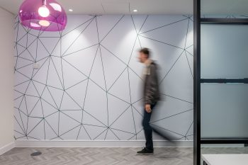
Geometric flooring is essential to the latest Scandi look. We explore how pattern creates…
November, 2017
The workplace is changing, with less space and more multi-functionality. Smart office design means going…