November, 2017
Geometric flooring is essential to the latest Scandi look. We explore how pattern creates a fresh take on an interior style that will add instant appeal to any commercial space.
With all eyes on simplicity in the 2016 interior world, this year, we began to see the development of pattern, colour and texture begin to move from walls and onto more unconventional areas of the room. Floors and ceilings began to take colour and pattern risks, offering a fresh alternative to feature walls and introducing excitement into interiors in small, softer doses. In keeping with the hottest Scandi inspired decor looks, this approach to colour and pattern blends well with stripped back, minimal decor yet offers depth and personality in a space.
Geometric patterns play a big part in achieving this look, offering pops of colour in a structured sense that fits in perfectly with a minimal aesthetic. And with plenty of commercial spaces striving to achieve that clean, calm Scandi look in the last few years, it can be difficult to stand out from the rest. Read on and find out more about the latest geometric floor trend and how it can transform a commercial space into one that’s more memorable than the rest.
Let pattern do the talking
For a subdued look that works particularly well with organic, outdoors-inspired interiors, a strong pattern in neutral colours will add striking depth to space. By sticking to a simple colour palette, you can afford to be more adventurous with style. Don’t be afraid to be bold. Jaunty patterns, oversized shapes and angular designs will all look great against pale walls and wood furniture.
Reignite your love of herringbone
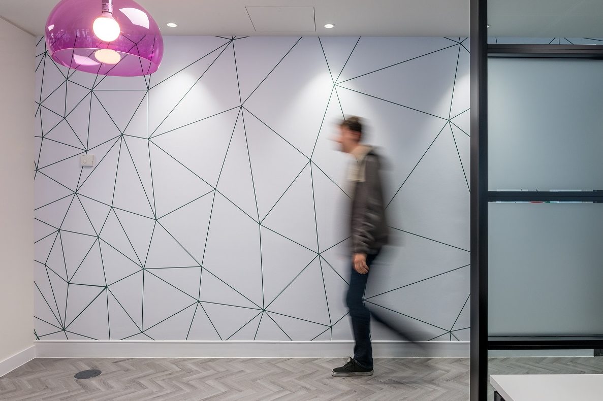
Herringbone is a timeless pattern that can be reinvented again and again. For a more classic interior, a statement herringbone in bold colours or simple monochrome will stand out and create interest against minimal decor. To give a stylish nod to art deco, opt for primary colour herringbone floor tiling against white walls. Not only will this add a playful element to your space, but it will offer workers a fresh, exciting look that will help the creative juices flow.
Let your floor be the only source of colour
Contrast a clean, calm whitewashed interior with a pop of colour from your floors. For the more adventurous commercial spaces, you can opt for an entire floor of colour and introduce angular, block-coloured furniture in mid-century designs. Or, for a subtler look, perhaps tile a small area or border instead. You can even create a playful, fashion-forward mismatched look by layering different patterns together. Just make sure that when it comes to this look, the bolder, the better.
To view the Duraflor Momenta Herringbone range click here.