December, 2020
Following a testing 2020, the trendsetters at Pantone have unveiled their “colour of the year” for 2021.
Except that for the second time in two decades, Pantone has paired colours that can be matched to convey a “message of happiness supported by fortitude”.
The choice for 2021 is “ultimate grey” (175104) and “illuminating” (13-0647) – a buttercup yellow.
While the American company may have taken inspiration from the current state of the world, it’s not hard to see how the pairing can flow through your flooring choices.
Why grey and yellow for 2021?
Each year, Pantone predicts palettes which may prove popular with consumers and commercial customers in interior and exterior design.
The institute has explained its selection this year, with the pale grey, described as “practical and rock-solid”, contrasting against the mid-tone yellow which is described as “warming and optimistic”.
That combination is intended to represent our ongoing discomfited state after a testing year. That is, uncertain hope coupled with renewed resilience as the global pandemic continues to rage alongside hopes of a return to normality.
Pantone invites some unflattering comparisons
Not all trend followers have been entirely complimentary, however. And it isn’t the first time the colour matching institute has made a contentious choice.
Yet, we can’t help but feel that this contrast of pallid grey and wintry sunshine is perfect for interiors.
Calming grey can tone down the uplifting strength of yellow, and the sunny shade gives grey a strength it otherwise would not possess. And they’re an extremely practical pairing for large areas such as walls and floors.
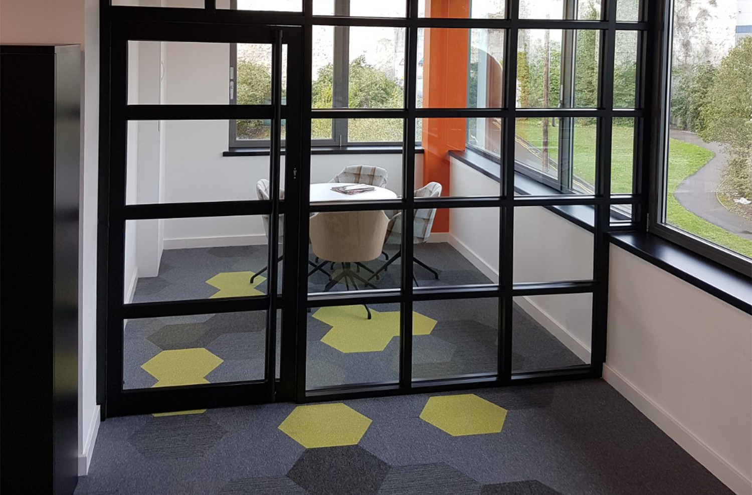
Grey and yellow in flooring
Grey – which was described by Ideal Home as the “colour of the decade” – is a timeless choice for flooring and is a perfect base for more vibrant highlights.
A neutral grey works alongside almost any secondary colour, particularly the illumination of yellow.
For utilitarian spaces such as offices, factories and public spaces, grey can be accentuated by yellow to uplift the environment or provide practical purposes such as place markings, route directions or highlighted spaces.
Perhaps Pantone’s choice of a dependable grey and cheery, illuminative yellow really is right for the spaces we create in 2021.

October, 2017
Location is often a top priority for companies looking to move or set up…
November, 2017
Geometric flooring is essential to the latest Scandi look. We explore how pattern creates…
November, 2017
The workplace is changing, with less space and more multi-functionality. Smart office design means going…