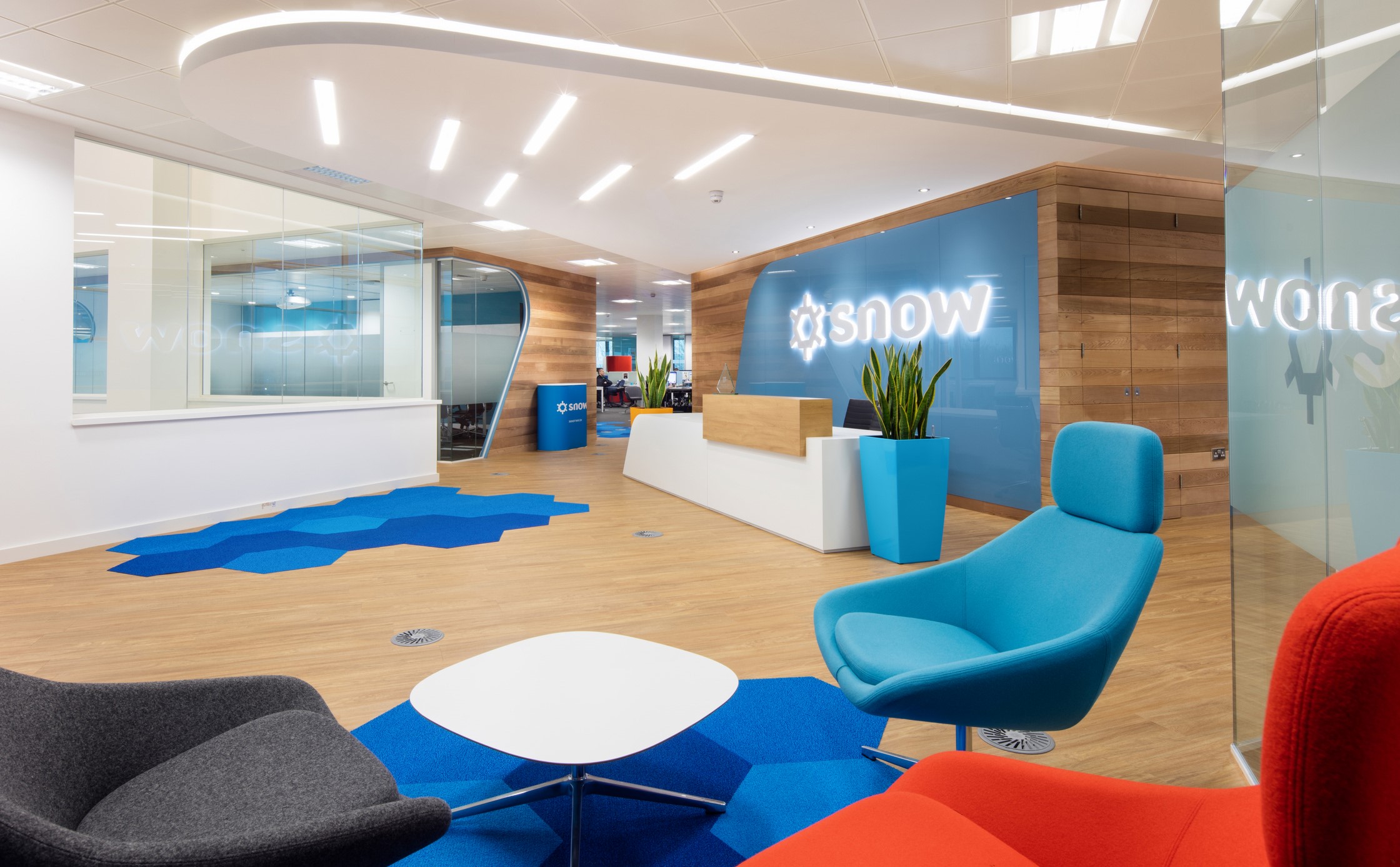
February, 2018
Your reception area is the first thing visitors and potential clients see, in this blog we look at how flooring design can help make that great first impression.
A new customer or a visitor who could potentially become a client is going to see your reception area first when they enter your building. The whole room should be optimised to tell that person what you want them to know about your business, without saying a word. There’s a huge amount you can get across with the design of your space, and practical ways you can lay it out for the best impression.
From the type of flooring, to the texture, to the pattern – there shouldn’t be a square inch of the floor that isn’t designed with some purpose in mind. Whether that’s to hint at your ethos, to wow them with the strength of your branding or to get them in a certain frame of mind for your meeting.
Your personality
Commercial flooring is available in so many different materials, styles and colours that there is no excuse for a boring choice. From carpet tiles to vinyl, there are options to suit whatever design choice or budget you happen to have. In order to have your reception flooring match your company’s personality, it’s important to think what you want to convey. If you’re trying to give the impression of a clinical, corporate organisation – muted tones in carpet tile or vinyl are a good idea. However, if you’re trying to show a quirky side, or you want to demonstrate your commitment to traditional values, a wood or stone patterned vinyl can be a more effective choice.
Humans are visual creatures, and it’s surprising how much difference it can make to have their first contact with your organisation exude so much of your personality. If they start off with the impression that you want to convey, it’s much easier to convince them of that fact later on – an opportunity wasted with an ordinary, uninspired space.
Zoning
While it’s good to show off your personality through flooring, don’t assume that a space decked out in your flooring of choice will cut it. You want to get as much out of your space as possible, and carving up your floor space for different functions can be a great way to maximise your floor’s potential. From a practical perspective, it can be useful to have entrance matting system or a barrier tile immediately at the entrance, to deal with the wear and tear of the outside world. After that, carpet tiling or luxury vinyl tiles signals to the visitor that they’ve arrived, and utilising your corporate colours in your flooring can add to a sense of immersion when visitors are standing at the reception desk.
Usually, your visitor will be directed over to a waiting area where they can sit down. This is where they will spend the majority of their time in reception, and where they’ll pick up the most cues about your business, so use this opportunity to tell them what you want them to know. Impress them with your cool design credentials and use a concrete-effect vinyl, make them feel warm and cosy with a wood effect, or give off a vibe of corporate sophistication with a sleek and shiny surface. Your reception area is a blank canvas – so use it wisely for maximum effect.
Feature Image: A great example from the design team at Office Principles