
November, 2023
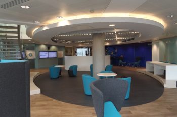
Colours play a pivotal role in commercial interior design, defining the ambiance and aesthetic of a space. 2023 has seen a notable shift in colour preferences in commercial interiors, both in the UK and across Europe, as designers seek to create environments that resonate with contemporary themes of well-being and technological integration. While our customers are mainly UK based we thought we would look at how choices may differ between the UK and other European countries.
In the UK, the colour palette is evolving to reflect a blend of sustainability and well-being. There is a move towards natural textures and sustainable materials, with a renewed appreciation for tactility. This approach has heightened the popularity of materials like raw natural clay plaster, which not only adds a unique texture but also contributes to healthier indoor air quality. The concept of biophilic design remains strong, with a preference for real plants and natural light, reinforcing a connection to nature within commercial spaces.
Circadian lighting is also gaining momentum in the UK, with innovative lighting designs being used to enhance moods and productivity by aligning with our natural circadian rhythms. This is often accompanied by bold and dramatic interior choices, inspired by digital advancements such as the metaverse. Pantone’s Colour of the Year for 2023, Viva Magenta, is expected to influence the UK’s commercial interiors with its bold statement, resonating particularly with younger generations.
In contrast, European colour trends showcase a rich and diverse palette, embracing maximalism, comfort, and nature. Opulence, with its indulgent use of saturated colours and rich textures, is making a comeback. This is paired with the use of polished metals and luxurious fabrics to create spaces that feel both grand and comforting. A modern palette of neutrals, grounded in earthy Nordic elements, is being used to evoke feelings of security and stability. Warm wood, cork, and steel textures are used to define spaces while adding an inviting softness with biophilic elements.
Curves and overstuffed pieces with a plush feel are also trending in Europe, reflecting a desire for comfort and serenity. Autumnal hues, like red, orange, and terra cotta, are being employed to bring an expressive mood to spaces, breaking from the previously dominant neutral trends. This is complemented by hues of Digital Lavender and other digital-inspired colours that reflect a balance between escapism and well-being, ideal for merging virtual and physical workspaces. Sustainability is also a key theme in Europe, with eco-conscious colours and materials pushing design boundaries to create layered, nature-inspired landscapes.
The juxtaposition of UK and European colour trends in commercial interior design reveals a shared emphasis on well-being and sustainability, albeit expressed through different palettes and materials. The UK’s approach seems to embrace the boldness and vibrancy of digital influence, while Europe leans more towards opulence, grounded natural tones, and the comfort of retro-inspired designs. For interior designers, these trends offer a wealth of inspiration for creating spaces that are both contemporary and conducive to the evolving demands of commercial environments.

August, 2017
Vinyl, laminate, hardwood, rubber or ceramic tiles? We take a look at the ideal…
October, 2017
Location is often a top priority for companies looking to move or set up…
November, 2017
Geometric flooring is essential to the latest Scandi look. We explore how pattern creates…